Downloads Page
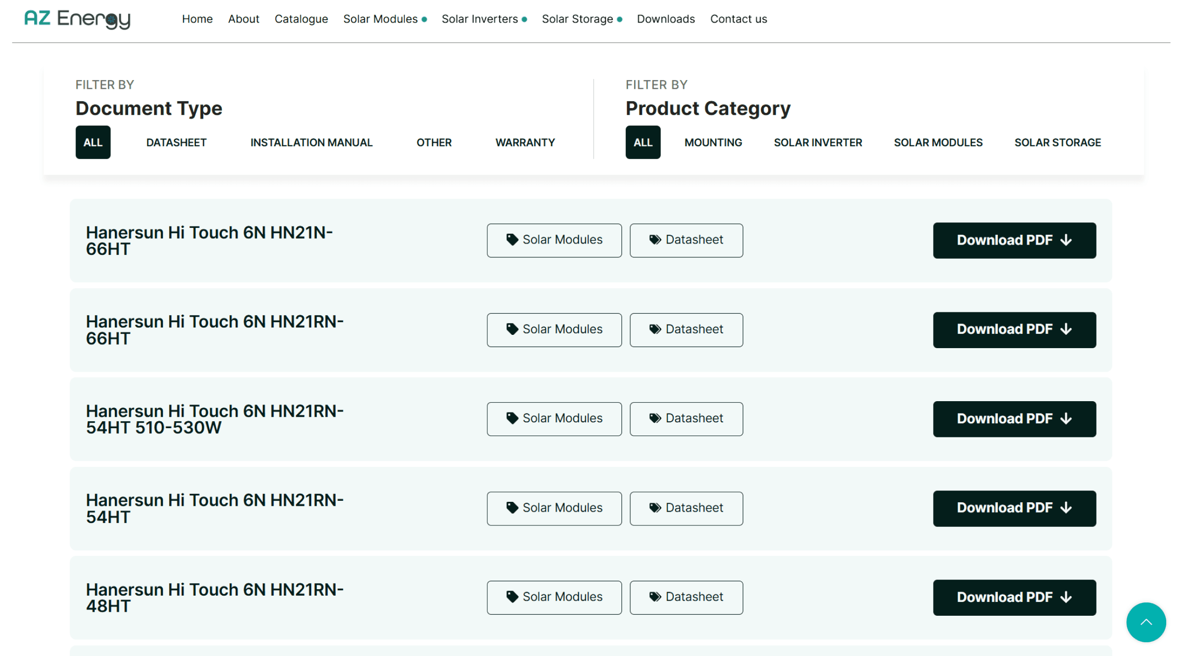
Quick filtering system, allowing users to search from 1 to numerous selected tags
The downloads page serves as a central base for customers to access the documents without having to search through the products page. Previously implemented in the old website, I have added document tags and filters for quick access and filtration.
100+ documents categorised with respective tags

Redesigned website & refreshed the brand identity to improve product discoverability, streamline navigation, and strengthen trust in the business.
The Problem
AZ energy is a solar energy supplier based in Victoria, Australia, supplying their customers with a wide range of products from industry giants such as Neovolt and Swatten. Besides suppling products, they aim to develop strong supplier-purchaser relationship with insights from the industry.
However, their digital presence failed to accurately represent the scale and credibility of their business and offerings. Their current website makes it difficult for customers to explore and evaluate the solar products due to unclear structure and challenging to access key information on products . Additionally, the company's outdated and inconsistent branding weakened their positioning in the market as a serious competitor in the solar energy market.
AZ Energy's digital presence failed to accurately represent the scale and credibility of their business and offerings. Their current website makes it difficult for customers to explore and evaluate the solar products due to unclear structure and challenging to access key information on products. Despite partnership with established manufacturers such as Neovolt, the company's outdated and inconsistent branding weakened their positioning in the market as a serious competitor in the solar energy market.
The Problem
AZ energy is a solar energy supplier based in Victoria, Australia, supplying their customers with a wide range of products from industry giants such as Neovolt and Swatten. Besides suppling products, they aim to develop strong supplier-purchaser relationship with insights from the industry.
However, their digital presence failed to accurately represent the scale and credibility of their business and offerings. Their current website makes it difficult for customers to explore and evaluate the solar products due to unclear structure and challenging to access key information on products . Additionally, the company's outdated and inconsistent branding weakened their positioning in the market as a serious competitor in the solar energy market.
AZ Energy's digital presence failed to accurately represent the scale and credibility of their business and offerings. Their current website makes it difficult for customers to explore and evaluate the solar products due to unclear structure and challenging to access key information on products. Despite partnership with established manufacturers such as Neovolt, the company's outdated and inconsistent branding weakened their positioning in the market as a serious competitor in the solar energy market.
The Objective
I worked with AZ energy to establish their main goal: to improve both the usability of the website and visual perception of the brand. This was further broken down to focused goals for both branding and website:
Website goals
Restructure the product catalogue with a clear website architecture, to create an intuitive browsing experience
Simple navigation for users to sort through 100+ products
Branding Goals
Develop a modern consistent visual identity that reflects industry credibility
Create expanable branding pack to be used across digital and print media
Create design templates for future marketing efforts



Icons


Typography

Redesigned website & refreshed the brand identity to improve product discoverability, streamline navigation, and strengthen trust in the business.
Research and Key Insights
I conducted a heuristic evaluation of AZ Energy’s existing website and a competitor analysis of solar distributors such as Neovolt.
The competitor review focused on product catalogue structure, navigation patterns, and how key information such as specifications and technical documents were presented.
Research and Key Insights
I conducted a heuristic evaluation of AZ Energy’s existing website and a competitor analysis of solar distributors such as Neovolt.
The competitor review focused on product catalogue structure, navigation patterns, and how key information such as specifications and technical documents were presented.
The Outcome
In the final design, I delivered a cohesive brand identity and a restructured website that improved overall usability and product discoverability across AZ Energy’s 100+ product catalogue
Refreshed Visual Identity
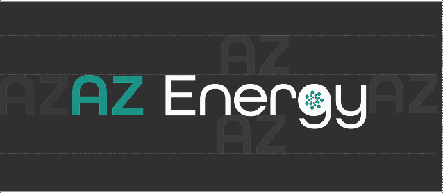
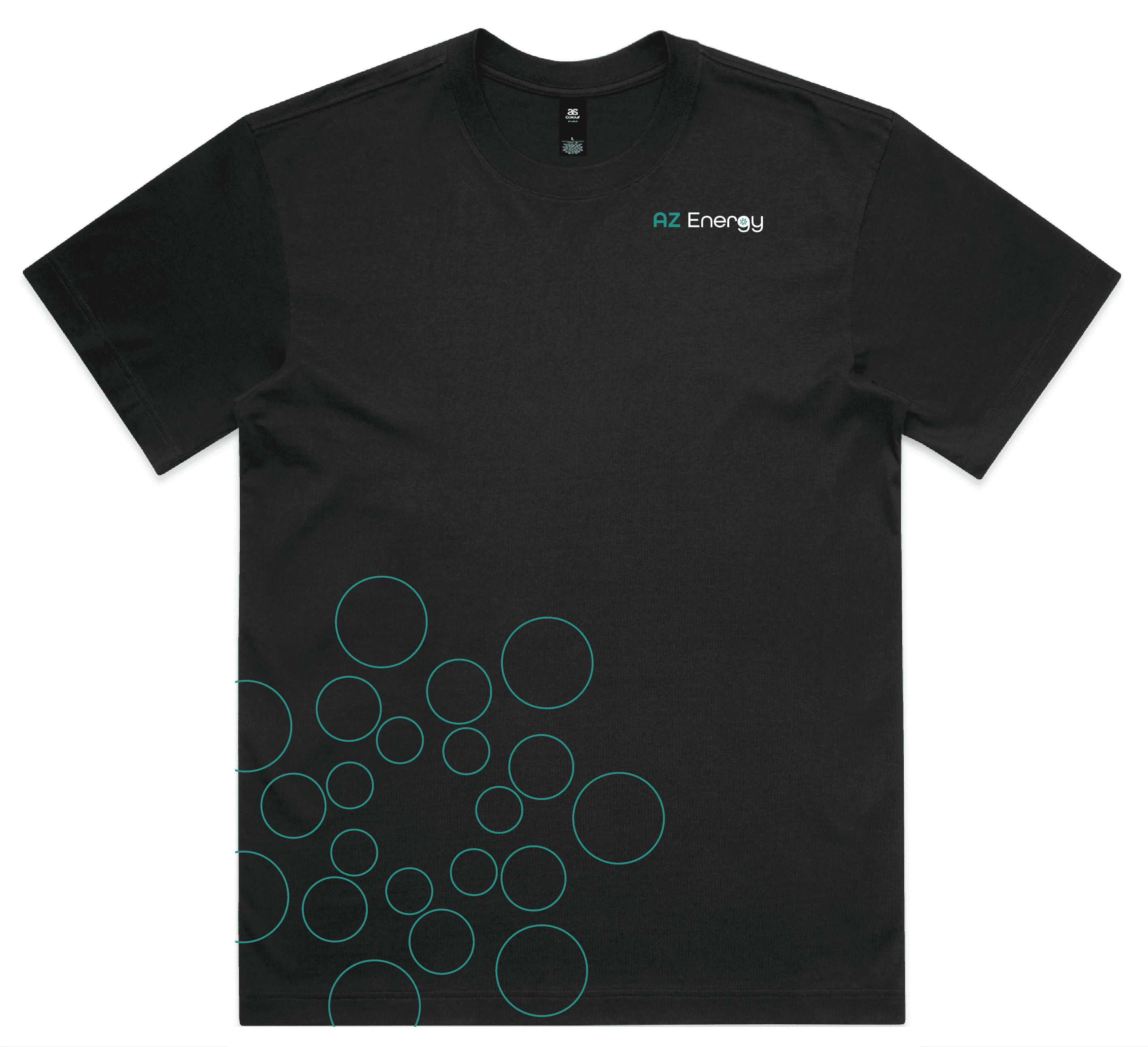
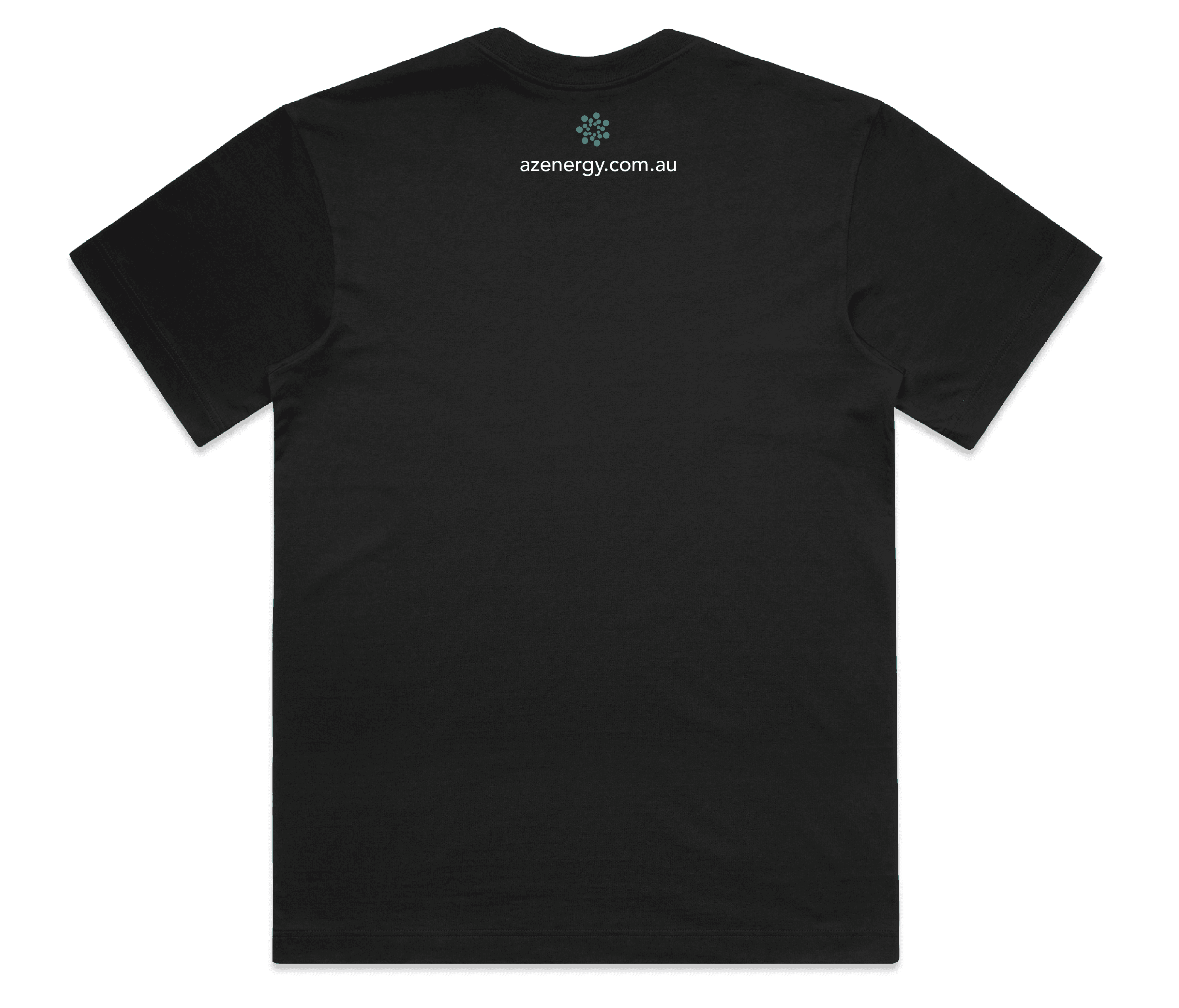
introduced a simplified logo system with adaptable iconography, designed to be used creatively and become a recognisable mark of the company across both digital and print applications.
Scalable Design System
Created a structured typography and defined UI design system that standardized key elements such as text styles, buttons, and interactive components.
Restructured Website
The new site improved navigation and reducing friction when accessing key information, with a focus on a mobile first experience to ensure consistent user experience.
Website goals
Restructure the product catalogue with a clear website architecture, to create an intuitive browsing experience
Reduce time to find products and/or product documents
Single depository for all product documents with clear filtering system
Simple navigation for users to sort through 100+ products
Branding Goals
Develop a modern consistent visual identity that reflects industry credibility
Align branding to be on par of other professional solar energy suppliers
Website goals
Restructure the product catalogue with a clear website architecture, to create an intuitive browsing experience
Reduce time to find products and/or product documents
Single depository for all product documents with clear filtering system
Simple navigation for users to sort through 100+ products
Branding Goals
Develop a modern consistent visual identity that reflects industry credibility
Align branding to be on par of other professional solar energy suppliers
The Objective
I worked with AZ energy to establish their main goal: to improve both the usability of the website and visual perception of the brand. This was further broken down to focused goals for both branding and website:
Leading distributors organise products by both category and brand, allowing users to quickly scan and compare options. AZ Energy’s structure lacked this clarity.
Competitors use structured
catalogues for easier browsing
Competitors presented a cohesive and modern visual identity, which strengthened trust. In contrast, AZ Energy’s inconsistent branding reduced perceived professionalism.
Consistent branding reinforces
credibility
Competitor sites made specification sheets and key details immediately visible, whereas AZ Energy required multiple steps to access this information.
Product information is
prioritised and easily accessible
Website mockup
After branding was finalised, I proceeded with creating visuals for the website, including the landing page and product catalogue


Apparel
Icons
Typography
Apparel


Icons
Typography
The Objective
I worked with AZ energy to establish their main goal: to improve both the usability of the website and visual perception of the brand. This was further broken down to focused goals for both branding and website:
The Problem
AZ Energy's digital presence failed to accurately represent the scale and credibility of their business and offerings. Their current website makes it difficult for customers to explore and evaluate the solar products due to unclear structure and challenging to access key information on products leaving users having to download several documents from the site. Additionally, the company's outdated and inconsistent branding weakened their positioning in the market as a serious competitor in the solar energy market. Despite partnership with established manufacturers such as Neovolt, the brand's lack of visual clarity needed to build trust with customers.
THE FINAL DESIGN
The final website was launched with an all-encompassing product catalogue.
Competitors use structured
catalogues for easier browsing
Leading distributors organise products by both category and brand, allowing users to quickly scan and compare options. AZ Energy’s structure lacked this clarity.
Consistent branding reinforces
credibility
Competitors presented a cohesive and modern visual identity, which strengthened trust. In contrast, AZ Energy’s inconsistent branding reduced perceived professionalism.
Product information is
prioritised and easily accessible
Competitor sites made specification sheets and key details immediately visible, whereas AZ Energy required multiple steps to access this information.
Refreshed Visual Identity
Introduced a simplified logo system with adaptable iconography, designed to be used creatively and become a recognisable mark of the company across both digital and print applications.
Scalable Design System
Created a structured typography and defined UI design system that standardised key elements such as text styles, buttons, and interactive components.
Restructured Website
The new site improved navigation and reducing friction when accessing key information, with a focus on a mobile first experience to ensure consistent user experience.
The Outcome
In the final design, I delivered a cohesive brand identity and a restructured website that improved overall usability and product discoverability across AZ Energy’s 100+ product catalogue

Apparel
Catalogue page
Detailed filtering system for quick access to products that tick all the boxes.


Research and Key Insights
I conducted a heuristic evaluation of AZ Energy’s existing website and a competitor analysis of solar distributors such as Neovolt.
The competitor review focused on product catalogue structure, navigation patterns, and how key information such as specifications and technical documents were presented.
Leading distributors organise products by both category and brand, allowing users to quickly scan and compare options. AZ Energy’s structure lacked this clarity.
Competitors use structured
catalogues for easier browsing
Consistent branding reinforces
credibility
Competitors presented a cohesive and modern visual identity, which strengthened trust. In contrast, AZ Energy’s inconsistent branding reduced perceived professionalism.
Competitor sites made specification sheets and key details immediately visible, whereas AZ Energy required multiple steps to access this information.
Product information is prioritised and easily accessible
Introduced a simplified logo system with adaptable iconography, designed to be used creatively and become a recognisable mark of the company across both digital and print applications.
Refreshed Visual Identity
The new site improved navigation and reducing friction when accessing key information, with a focus on a mobile first experience to ensure consistent user experience.
Restructured Website
Scalable Design System
Created a structured typography and defined UI design system that standardised key elements such as text styles, buttons, and interactive components.
The Outcome
In the final design, I delivered a cohesive brand identity and a restructured website that improved overall usability and product discoverability across AZ Energy’s 100+ product catalogue
Redesigned website & refreshed the brand identity to improve product discoverability, streamline navigation, and strengthen trust in the business.
downloads page
A page dedicated to all the documents the website is holding, with filteration system in place to sift through the 100+ downloadable content avaliable.
The mockups captured the vision — but during development , new constraints surfaced. Here's what came up once the product page met real data and real users, and what I carried forward.
Challenges and Learnings
Underestimated system complexity in early mockups
The initial mockups designed a single, fixed layout for the product page. Once development began, it became clear that suppliers vary widely in what documentation they provide.
I restructured the layout in code to support four distinct document fields per product. Where a document type wasn't available for a given product, the field still displays but is greyed out, signaling to users what exists across the catalogue rather than silently omitting it.
Challenges and Learnings
Retrofitting a downloads page mid-development
The client approved a dedicated downloads page partway through the build. This meant connecting 100+ existing product documents to a filtering system that hadn't been part of the original architecture. I built a tagging structure that mapped each document to its corresponding filter, letting users search and filter across the full document library without a rebuild of the existing product pages.
Challenges and Learnings
Designing for post-launch content maintenance
Launch went smoothly, but ownership of ongoing content updates hadn't been defined during the project. The update process I'd set up was intuitive to me as the designer, but not to the client's team once they took over.
I provided training and documentation to walk them through updating products and spec sheets, however, the biggest takeaway was to design backend/content-management experience with the same care as the user-facing experience.
Website mockup
After branding was finalised, I proceeded with creating visuals for the website, including
the landing page and product catalogue
Initial Process
Updated Process
downloads page
A page dedicated to all the documents the website is holding, with filteration system in place to sift through the 100+ downloadable content avaliable.
Challenges and Learnings
Underestimated system complexity in early mockups
The initial mockups designed a single, fixed layout for the product page. Once development began, it became clear that suppliers vary widely in what documentation they provide.
I restructured the layout in code to support four distinct document fields per product. Where a document type wasn't available for a given product, the field still displays but is greyed out — signalling to users what exists across the catalogue rather than silently omitting it.
Challenges and Learnings
Retrofitting a downloads page mid-development
The client approved a dedicated downloads page partway through the build. This meant connecting 100+ existing product documents to a filtering system that hadn't been part of the original architecture, so I built a tagging structure that mapped each document to its corresponding filter — letting users search and filter across the full document library without a rebuild of the existing product pages.
Challenges and Learnings
Designing for post-launch content maintenance
Launch went smoothly, but ownership of ongoing content updates hadn't been defined during the project. The update process I'd set up was intuitive to me as the designer, but not to the client's team once they took it over.
I provided training and documentation to walk them through updating products and spec sheets, however, the biggest takeaway was to design backend/content-management experience with the same care as the user-facing experience.
Challenges and Learnings
Designing for post-launch content maintenance
Launch went smoothly, but ownership of ongoing content updates hadn't been defined during the project. The update process I'd set up was intuitive to me as the designer, but not to the client's team once they took it over.
I provided training and documentation to walk them through updating products and spec sheets. However, the biggest takeaway was to design backend/content-management experience with the same care as the user-facing experience.


Updated Process
Initial Process
Initial Process
Initial Process
Updated Process
Updated Process
The mockups captured the vision — but development surfaced real-world constraints no static design could predict. Here's what came up once the product page met real data and real users, and what I carried forward
The mockups captured the vision — but development surfaced real-world constraints no static design could predict. Here's what came up once the product page met real data and real users, and what I carried forward
The mockups captured the vision — but development surfaced real-world constraints no static design could predict. Here's what came up once the product page met real data and real users, and what I carried forward
THE FINAL DESIGN
The final website was launched with an all-encompassing product catalogue.
THE FINAL DESIGN
The final website was launched with an all-encompassing product catalogue.
Catalogue page
Detailed filtering system for quick access to products that tick all the boxes.
Catalogue page
Customised single product page with mobile responsiveness and designed to support all product
download type

Catalogue page
Detailed filtering system for quick access to products that tick all the boxes.