
Redesigning the digital experience for a growing nationwide car wash brand
Redesigning the digital experience for a growing nationwide car wash brand through booking system for 20+ nationwide locations
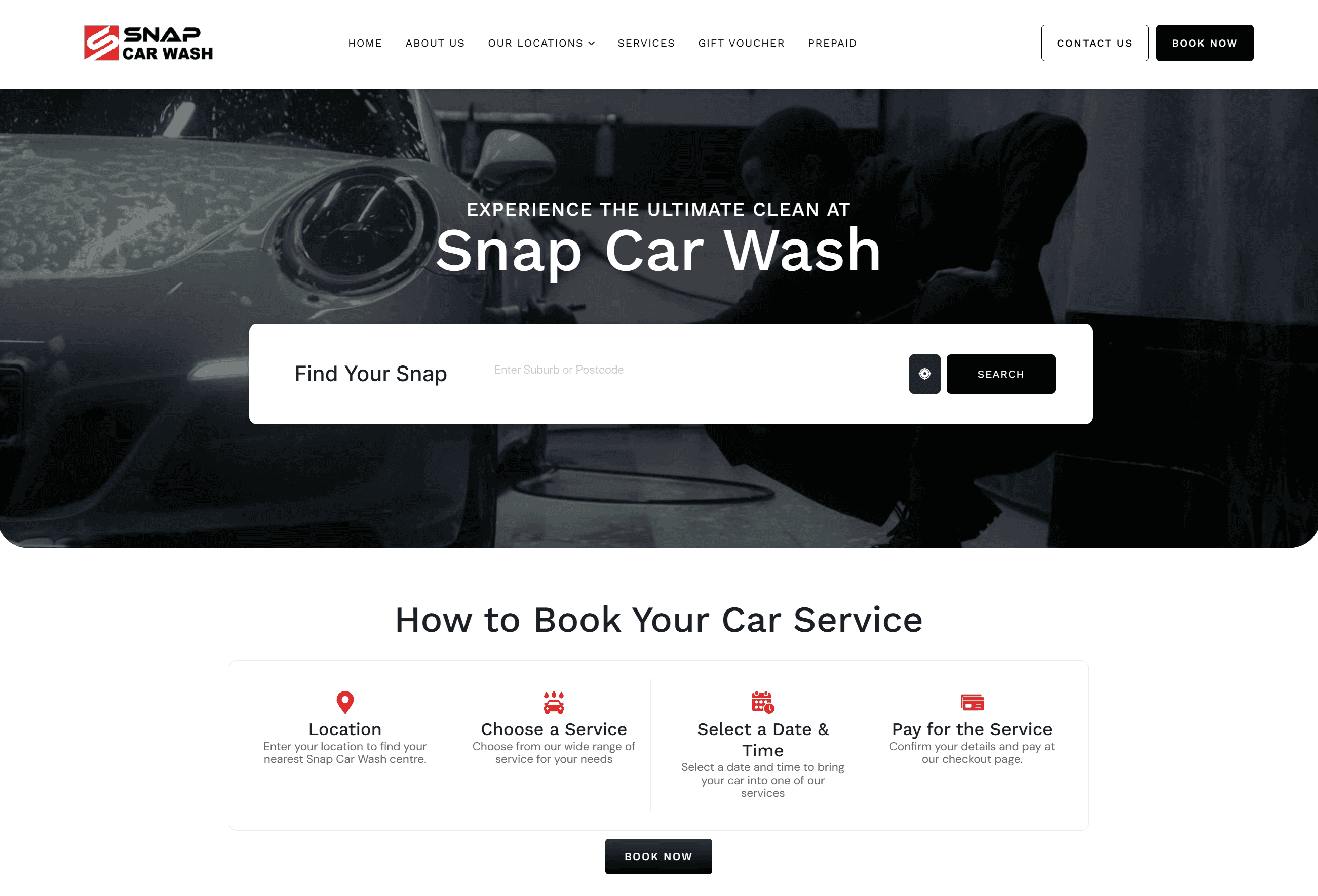
Snap Car Wash is an Australian car wash company, boasting over 20+ stores nationwide. However their current website created a poor reflection on their brand and credibility. Their aim is to improve their website’s design and create an online booking system, working in sync with their in store POS system, to handle bookings for all 20+ stores.
Snap Car Wash is an Australian car wash company, boasting over 20+ stores nationwide. However their current website created a poor reflection on their brand and credibility. Their aim is to improve their website’s design and create an online booking system, working in sync with their in store POS system, to handle bookings for all 20+ stores.
The Problem
Snap Car Wash needed a digital experience that reflected the quality and professionalism of its growing brand
However, its existing website no longer met customer expectations. The interface felt visually outdated, creating a weaker first impression and making the business appear less competitive than other providers in the market. Customers were unable to book services online due to previous attempts at developing a booking system failing during technical implementation.
The challenge was to redesign the website into a modern, trustworthy platform that strengthened brand perception while introducing a seamless online booking experience that supported both user needs and business goals.
The Objective
I worked with the developer on our team to establish key milestones of the project, to achieve Snap Car Wash’s main goal: improve the visual design and structure of their website and establish a comprehensive but simple booking system. I broke these down further to focused goals for my role as a designer in this project:
Website Goals
Redesign the website to match the branding of Snap and reflect the company’s scale
Convert casual viewers to create their first online booking
Develop current branding to create a consistent visual identity and design system
Booking goals
Design intuitive booking pathways that simplify service selection, customisation, and checkout across mobile and desktop devices
Create a mobile-first booking experience that simplifies complex service selections, add-ons, and promotional options into a clear step-by-step journey

RESEARCH & KEY INSIGHTS
To understand the competitive landscape and identify opportunities for improvement, I conducted a comparative analysis of leading car wash providers across Australia.
With the website published live, the lead developer and I started creating the booking system. However, throughout this process certain challenges arised…
With the website published live, the lead developer and I started creating the booking system. However, throughout this process certain challenges arised
Competitors use structured
catalogues for easier browsing
Leading distributors organise products by both category and brand, allowing users to quickly scan and compare options. AZ Energy’s structure lacked this clarity.
Consistent branding reinforces
credibility
Competitors presented a cohesive and modern visual identity, which strengthened trust. In contrast, AZ Energy’s inconsistent branding reduced perceived professionalism.
Competitor sites made specification sheets and key details immediately visible, whereas AZ Energy required multiple steps to access this information.
Product information is prioritised and easily accessible
Competitors use structured
catalogues for easier browsing
Leading distributors organise products by both category and brand, allowing users to quickly scan and compare options. AZ Energy’s structure lacked this clarity.
Consistent branding reinforces
credibility
Competitors presented a cohesive and modern visual identity, which strengthened trust. In contrast, AZ Energy’s inconsistent branding reduced perceived professionalism.
Competitor sites made specification sheets and key details immediately visible, whereas AZ Energy required multiple steps to access this information.
Product information is prioritised and easily accessible
Alongside this, I performed a content and structural review of Snap Car Wash's existing website, analysing the site's architecture and navigation, documented the existing sitemap, and assessed how key information such as services, pricing, and store locations was organised and presented. With this, I started creating the website mock-up and implementing it on the live website.
Third-party/API constraints
The booking experience relied on a third-party API, which introduced technical constraints that weren't fully apparent during the initial design phase.
The intial designs were created around an idealised user experience, however once the third-party API was implemented, limitations revealed itself. Certain booking data and interface elements were handled in a specific way by the API, causing discrepancies between the mock-up and final product.
I worked alongside the developer to identify which aspects of the experience could be controlled and which were constrained, and then adapted the UI and prioritised elements that had the greatest impact on clarity and usability
Third-party/API constraints
The booking experience relied on a third-party API, which introduced technical constraints that weren't fully apparent during the initial design phase.
The intial designs were created around an idealised user experience, however once the third-party API was implemented, limitations revealed itself. Certain booking data and interface elements were handled in a specific way by the API, causing discrepancies between the mock-up and final product.
I worked alongside the developer to identify which aspects of the experience could be controlled and which were constrained, and then adapted the UI and prioritised elements that had the greatest impact on clarity and usability
Features such as the gift card purchasing experience required additional UI designs to communicate how these interactions should work and fit within the broader website experience.
Going forward, I would establish a more structured design-to-development process, including earlier technical discussions, clearer documentation of interactions and regular design reviews during implementation.
Features such as the gift card purchasing experience required additional UI designs to communicate how these interactions should work and fit within the broader website experience.
Going forward, I would establish a more structured design-to-development process, including earlier technical discussions, clearer documentation of interactions and regular design reviews during implementation.
As development progressed, gaps in communication around smaller interactions and features meant that additional design decisions had to be made reactively
As development progressed, gaps in communication around smaller interactions and features meant that additional design decisions had to be made reactively
improving designer-developer collaboration


The Problem
Snap Car Wash needed a digital experience that reflected the quality and professionalism of its growing brand
However, its existing website no longer met customer expectations. The interface felt visually outdated, creating a weaker first impression and making the business appear less competitive than other providers in the market. Customers were unable to book services online due to previous attempts at developing a booking system failing during technical implementation.
The challenge was to redesign the website into a modern, trustworthy platform that strengthened brand perception while introducing a seamless online booking experience that supported both user needs and business goals.
Website Goals
Redesign the website to match the branding of Snap and reflect the company’s scale
Convert casual viewers to create their first online booking
Develop current branding to create a consistent visual identity and design system
Booking goals
Design intuitive booking pathways that simplify service selection, customisation, and checkout across mobile and desktop devices
Create a mobile-first booking experience that simplifies complex service selections, add-ons, and promotional options into a clear step-by-step journey
With the website published live, the lead developer and I started creating the booking system. However, throughout this process certain challenges arised…
The Problem
Snap Car Wash needed a digital experience that reflected the quality and professionalism of its growing brand
However, its existing website no longer met customer expectations. The interface felt visually outdated, creating a weaker first impression and making the business appear less competitive than other providers in the market. Customers were unable to book services online due to previous attempts at developing a booking system failing during technical implementation.
The challenge was to redesign the website into a modern, trustworthy platform that strengthened brand perception while introducing a seamless online booking experience that supported both user needs and business goals.
The Objective
I worked with the developer on our team to establish key milestones of the project, to achieve Snap Car Wash’s main goal: improve the visual design and structure of their website and establish a comprehensive but simple booking system. I broke these down further to focused goals for my role as a designer in this project:
Website Goals
Redesign the website to match the branding of Snap and reflect the company’s scale
Convert casual viewers to create their first online booking
Develop current branding to create a consistent visual identity and design system
Booking goals
Design intuitive booking pathways that simplify service selection, customisation, and checkout across mobile and desktop devices
Create a mobile-first booking experience that simplifies complex service selections, add-ons, and promotional options into a clear step-by-step journey
Alongside this, I performed a content and structural review of Snap Car Wash's existing website, analysing the site's architecture and navigation, documented the existing sitemap, and assessed how key information such as services, pricing, and store locations was organised and presented. With this, I started creating the website mock-up and implementing it on the live website.
THE FINAL DESIGN
Clear service information for confident decisions
Customers needed to choose between multiple service types and add-ons, so each service was presented with a concise description of what was included, its estimated service time, and relevant pricing. This gave customers enough information to make a decision without leaving the booking flow.
Customers needed to choose between multiple service types and add-ons, so each service was presented with a concise description of what was included, its estimated service time, and relevant pricing. This gave customers enough information to make a decision without leaving the booking flow.
Keeping customers oriented throughout the booking flow
The booking journey involved several steps and decisions, increasing the amount of information customers needed to keep track of. A persistent booking summary allowed customers to review their selections at any point, reducing the need to remember information from previous steps.
The booking journey involved several steps and decisions, increasing the amount of information customers needed to keep track of. A persistent booking summary allowed customers to review their selections at any point, reducing the need to remember information from previous steps.
A successful experience isn't determined solely by how well a design works in Figma, but by how effectively it can be translated into the technical systems behind it. Working with existing APIs and POS requirements highlighted the importance of involving developers early, as technical constraints can directly shape the final customer experience.
A successful experience isn't determined solely by how well a design works in Figma, but by how effectively it can be translated into the technical systems behind it. Working with existing APIs and POS requirements highlighted the importance of involving developers early, as technical constraints can directly shape the final customer experience.
Designing within real-world constraints requires collaboration beyond the design process.
Learnings and reflection
Preventing accidental changes
The booking journey involved several steps and decisions, increasing the amount of information customers needed to keep track of. A persistent booking summary allowed customers to review their selections at any point, reducing the need to remember information from previous steps.
A successful experience isn't determined solely by how well a design works in Figma, but by how effectively it can be translated into the technical systems behind it. Working with existing APIs and POS requirements highlighted the importance of involving developers early, as technical constraints can directly shape the final customer experience.
Designing within real-world constraints requires collaboration beyond the design process.
Learnings and reflection

RESEARCH & KEY INSIGHTS
To understand the competitive landscape and identify opportunities for improvement, I conducted a comparative analysis of leading car wash providers across Australia.
Preventing accidental changes
The booking journey involved several steps and decisions, increasing the amount of information customers needed to keep track of. A persistent booking summary allowed customers to review their selections at any point, reducing the need to remember information from previous steps.
The booking journey involved several steps and decisions, increasing the amount of information customers needed to keep track of. A persistent booking summary allowed customers to review their selections at any point, reducing the need to remember information from previous steps.